Affiliate Disclosure: This post contains affiliate links. If you buy through one of them, we may earn a small commission — at no extra cost to you. We only recommend kits we’ve actually researched and would suggest to a friend.
The Email Arrives, and Then… Now What?
You get the notification. Results are ready. You click through, and suddenly you’re staring at a dashboard full of percentages, colored regions on a map, a list of hundreds of “DNA matches” with unfamiliar names, and terms like “centimorgans” that nobody warned you about.
It’s a lot, all at once. Here’s how to actually make sense of it, section by section.
Starting With the Ethnicity Estimate
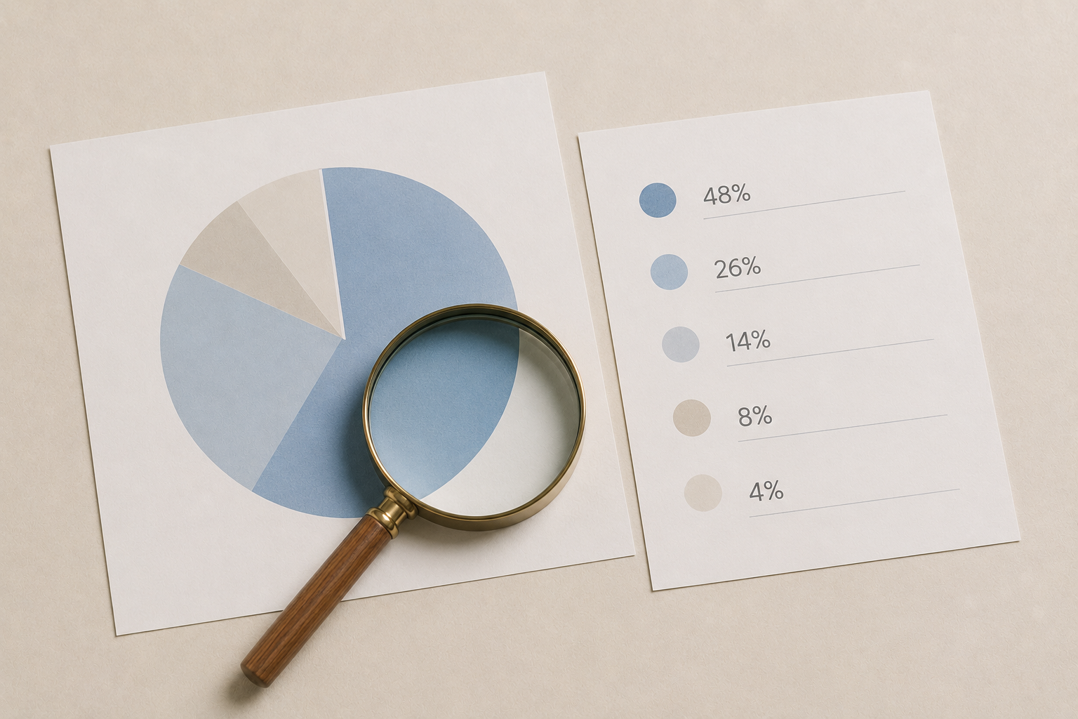
This is usually the first thing you’ll see, and it’s the part most people zoom in on immediately — a pie chart or map showing your ancestry broken down by region and percentage.
A few things worth knowing as you read it:
The percentages are estimates, not facts. They’re calculated by comparing your DNA to a reference database, so two different companies can give you somewhat different breakdowns for the exact same DNA. Neither is necessarily “wrong” — they’re working from different comparison data.
Broad categories tend to be more reliable than narrow ones. A result showing “40% Northern European” is on firmer ground than a result claiming a precise 3% from one small, specific sub-region. The more granular the claim, the more it’s worth treating as a rough signal rather than a fixed number.
Small percentages (under 5%) deserve some skepticism. These can sometimes reflect statistical noise rather than a real, traceable ancestral line — not always, but often enough that it’s not worth building a whole family narrative around a 2% result alone.
Understanding DNA Matches and Centimorgans
This is the section that trips up the most people, mostly because of one unfamiliar unit: the centimorgan (often abbreviated cM).
A centimorgan is a unit of measurement for shared DNA — think of it as roughly analogous to how “miles” measures distance. The more centimorgans you share with someone, the more closely related you likely are. As a rough guide:
- Parent/child or full siblings: several thousand shared cM
- First cousins: typically several hundred cM
- Second cousins: usually somewhere in the low hundreds
- Distant cousins (fourth and beyond): often under 50 cM, sometimes just a handful
That last category is where things get genuinely uncertain. A very low cM match could represent a real but distant relative, or in rare cases, a coincidental small overlap that doesn’t reflect a recent common ancestor at all. Most testing platforms will show you an estimated relationship range (like “third to fifth cousin”) rather than a single definitive answer, precisely because of this uncertainty.
Making Sense of Shared Matches
Beyond your direct match list, most platforms show you “shared matches” — other people who match both you and a specific relative. This feature is more useful than it might first appear.
If you’re trying to figure out how a mystery match connects to your tree, looking at who else they share DNA with (and how those people connect to your known family) can help triangulate the relationship, especially when the mystery match hasn’t filled out a family tree of their own.
What Trait and Wellness Reports Actually Tell You
If your kit includes trait or wellness reports — things like caffeine sensitivity, or whether you’re likely to have a sweet tooth — it helps to read these differently than the ancestry or match data.
These reports are based on specific genetic markers with varying levels of scientific support behind them. Some are backed by substantial research; others are based on smaller or newer studies. Treat them as an interesting data point about your biology, not a definitive verdict — and definitely not medical advice, even if the report format looks clinical.
A Practical First-Time Checklist
When you first open your results, it can help to go through them in a specific order rather than jumping around:
- Start with the ethnicity estimate for the big picture, but don’t over-interpret small percentages yet.
- Skim your closest matches (highest cM) first — these are the most reliable and often the most immediately useful.
- If you’re building a family tree, work backward from known relatives before chasing distant, unfamiliar matches.
- Save trait and wellness reports for last, and read them as general interest rather than fact.
When the Results Don’t Match What You Expected
Sometimes results surface something unexpected — an ethnicity percentage that doesn’t match family stories, or a close match you weren’t expecting. This happens more often than people assume, and there are usually non-dramatic explanations: incomplete family knowledge, migration patterns nobody documented, or simply a reference database that’s still refining its regional accuracy.
If a result raises a genuinely sensitive question about family history, it’s worth taking time before drawing conclusions — and in some cases, worth discussing with a professional genetic genealogist rather than working it out alone from a dashboard.
Comparing How Different Platforms Present Results
Not every company organizes this information the same way — some make the match list and shared-match tools more intuitive than others. If you’re still deciding which kit to test with, our comparison of the major DNA testing kits covers how each platform’s dashboard and matching tools stack up.
Frequently Asked Questions
What’s a good centimorgan number for a “real” relative? There’s no strict cutoff, but matches above roughly 20 cM are generally more reliable indicators of a genuine, traceable relationship than matches in the single digits, which can sometimes reflect more distant or ambiguous connections.
Why do my ethnicity percentages look different from my sibling’s? Because you each inherit a different random half of your parents’ DNA, siblings can show meaningfully different ethnicity breakdowns even though you share the same family tree.
Should I trust a very specific, narrow ethnicity result? Treat highly specific, small percentages with some caution — broader regional estimates tend to be more statistically reliable than very fine-grained claims.
The Bottom Line
Your results aren’t meant to be read all at once and fully understood on the first pass — they’re closer to a research tool you’ll return to over time. Start with the big, reliable signals (close matches, broad ethnicity categories), treat the fine details as interesting rather than definitive, and the whole dashboard becomes a lot less overwhelming.
コメントを残す